 I’m still here (after nearly a week of not writing)! I’ve got a long list of topics to write about here on TheDentalWarrior.com. But, I was inspired to write this based on a recent experience.
I’ve been skeptical about the value and potential of social media, in general. And, I’ve been leery of paid advertising in social media like Facebook. In a previous blog post, I mentioned that I was surprised to have some luck (ROI) with Facebook ads. I initially did it as a bit of a lark. But, to my surprise, I have gotten a number of good patients from those ads. So, it occurred to me that I should expand my advertising efforts on Facebook. Check this out…
One of the services I offer in my practice that is very marketable is the 6 Month Smiles brand of short term cosmetic orthodontics. It’s a wonderful service that people find appealing. So, I’m focusing on that at the moment. Naturally, cosmetic services generally appeal to women more than men. I have always oriented my cosmetic marketing efforts towards women. However, I do have a fair number of men who want cosmetic services, and many of them are “motivated” by the women in their lives. Big surprise, eh?
So, I went to work on a new ad that was directed towards women but with the idea of compelling them to send their HUSBANDS in for cosmetic short term ortho. Men will do anything for their wives or significant others, right? Many will, anyway!
Remember that Facebok ads can be targeted to very specific demographics. You can specify geographic limits, age range, gender, marital status, and even hobbies and interests.
Designing a Facebook Ad
Before I start, I want to say this article is not a comprehensive exposition on Facebook advertising. Facebook has a wonderful guide on the nitty-gritty of setting up an account and creating ads. My desire is to give you a bit of a dental perspective based on my own experience.
Facebook ads have space for a small image (110 x 80 pixels) and a small amount of text. The headline is limited to 25 characters, while the ad copy is limited to 135 characters. That’s not much! It’s like the “twitter” of ad copy writing! You’ve got to be creative and to the point. The goal is to capture a Facebook user’s attention – away from the fascinating “news feed” about their friend’s most recent meal, or “mafia wars” and “farmville” games. That’s a tall order!
I will readily admit I am not a master ad copy writer, nor is my experience vast. But, I do enjoy the process. And, I enjoy measuring what works vs. what doesn’t. Facebook ads provide a nice statistical analysis that helps figuring out what works. But, you need to measure the results at your office, too. Really understanding your effectiveness requires a combination of measurements. I’ll get into that later. But, let’s talk about designing an ad. Bear in mind that I am learning as I go, and I’m sharing my efforts with you in “real time.” I like to say, “Your mileage may vary.” 🙂
OK… As I said, this week I went to work on a new ad. Here’s the first ad I submitted:
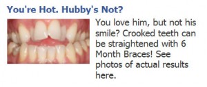
It got rejected. They said the image was OFFENSIVE! I am not kidding. It’s just teeth! I Then I submitted this alternative:
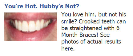
They rejected that one for the same reason! “Offensive image!” WTF? I sent an appeal to the folks at Facebook. They wrote back and said it was a mistake… the image was OK, but the text was NOT! They felt the ad copy was offensive. Geez, Louise! Which is it? And, how can any of it be “offensive?”
So, I worked up a third ad. I used the original image and “cleaned up” the copy:
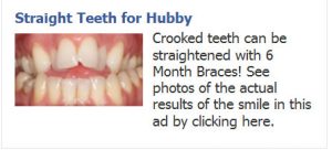
REJECTED! Why? The image was offensive. This again??? Your email to me said the image of teeth was OK (you made a mistake) but the copy was offensive. Which is it?? OK, now I’m getting pissed. I haven’t yet, but I plan on writing to them again in protest of the rejection. But, before that I decided to try one more approach:

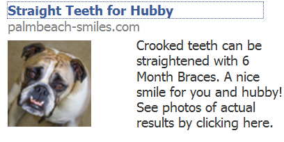
Last night, I heard back. APPROVED! Success! My thought process here was to use some humor with the image (which I purchased from a stock photo company). The bulldog has crooked teeth. And, there’s just something about bulldogs.. they’re so ugly, they’re cute. They just make you smile. I wanted a headline that grabbed attention, hence the “You’re hot, Hubby’s not?” headline. But, I guess that was “offensive.” I thought it was catchy and fun. Oh well! So, for my final submission, I went tame on the headline and ad copy. And, it flew. So, now we’ll see if it works!
Is My Ad Working?
Once again, I am not an expert on the finer points of marketing metrics (measuring your results). My approach may be crude and not meet the approval of a freshly minted MBA. But, I offer it to you for what it’s worth. I figure my approach is better than none. 🙂
First, Facebook offers some statistics on your ads such as:
- How many “impressions” you’ve gotten. That means how many times your ad showed up on someone’s Facebook page.
- How many clicks your ad got.
- Your CTR (click through rate), which is a percentage of clicks out of the number of impressions.
- What you’ve spent per click on average.
- How much you’ve spent to date.
- And more!
Here’s an example of the kind of information you can get:
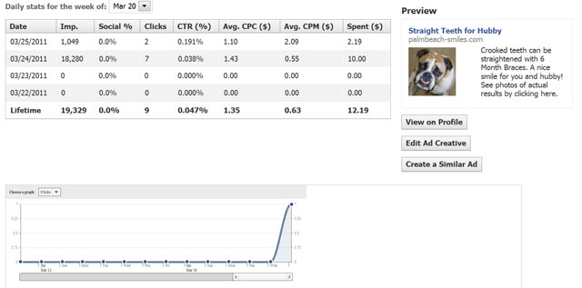
I just started this ad, so there’s not much data, yet.
So, you’ve got clicks, so they say. How do you know if they actually went to your website? If you haven’t already, have Google Analytics installed on your website. Make sure you have it on EVERY PAGE of your website. With Google Analytics, you can mine a cornucopia of data about the traffic to your website, including where visitors came from (such as Facebook). So, you can find out if your Facebook ad is sending actual traffic to your site.
What’s a Landing Page?
Now we get to a valuable pearl that will help you track how your ads are doing. Generally, you do not want to have your ad link to your website homepage. In most cases, you want the ad to link to a specific page on your website. I repeat… do not link your ad to your homepage.
There are a couple of reasons for this. One is that many ads focus on a particular or unique service. So, if your ad is about implants, then you don’t want the prospect to land on your homepage and then WORK to figure out where to click AGAIN to find the information about implants. It’s much better if the prospect clicks and lands directly on a web page about implants. Take them straight to the good stuff! Don’t make them search for it. I promise very few will.
The other reason… the other half of this pearl… is you can create a SPECIAL landing page just for each ad. This will especially be handy when you’re running multiple ads. Each ad will have it’s own special landing page. This way you can track each ad’s effectiveness by looking at the traffic (Google Analytics) for each of those landing pages. Some ads work. Some don’t. You want to dump the ones that don’t, so you don’t throw away money. Make sense?
One of the cool things about a special landing page is that you can create unique content that is customized for the people responding to the Facebook ad. You can address them personally and specifically as it pertains to their interests and the theme of the ad. OK, reading that last sentence myself, it could sound a bit obtuse. Here’s what I mean. Let’s say you targeted your ad about Whitening to young women engaged to be married. On your landing page, you can create content that is geared towards brides-to-be; whereas your normal web page about whitening would not normally have a wedding theme. I hope that made sense. 🙂
What does a landing page look like?
In this blog, I’m keeping no secrets. I believe a rising tide lifts all ships. So, I’m going to share the landing page I created for the Facebook ad I’ve featured in this blog post. My goal was to create some unique content that would resonate with the people that clicked on the Facebook ad. I like to write in a conversational manner. I like to sprinkle in some humor. And, I like to be very transparent. I believe the public really likes that. My website style is not flashy. I’m not trying to impress anyone with a web page that had more time spent on the appearance than on the content. People looking for health care on the web want INFORMATION. And, I like to get right down to the business of information. My goal is to immediately give them the reason (they’re looking for) to pick me as their dentist. I’m not looking to distract them with flashy graphics. Click on the ad image below to see the landing page.
OK, my fellow dental warriors… that’s about 1500 words. More than enough for you to digest. Facebook advertising is not rocket science. You can do this yourself! If you made it this far, I hope you found it helpful. Go get’em!
 Copyright protected by Digiprove © 2013 The Dental Warrior®
That was a total LOL for me Mike!
I had the same experience trying to advertise DMDrep – picture after picture they found offensive – basically everything I posted that had a picture of a smile or teeth.
How can a picture of teeth be offensive? That’s what I need to know! Maybe the person looking at the picture finds it objectionable to smile? Are they offended by people with teeth because they don’t have any? Or maybe they are just missing a couple and don’t think its’ reasonable to advertise fixing them?
Ah well – thanks for the excellent advice as usual. I sent a link to “The Dental Warrior” to all my friends!
Smile!
Warren
The weird thing is I had two other ads (been running for some time) that have smile photos. I tried three times to make this ad with the teeth. No go until I put the bulldog on there.
LOL! Those crooked teeth ARE offensive, Mike!!! Good thing they can be fixed!! 😉
I saw your cute dog and wanted to share that I have been experimenting with FB ads for about a year and the one that has received the most clicks was one that had a picture of a happy looking dog. Number two with success is one with a happy little kid. Isn’t there an old acting saying about never trying to compete on screen with animals and kids?
That’s interesting, Dawn! I’ll keep everyone posted on how the bulldog ad goes!
Great before & After photos on your landing page.
Mike, you might consider creating that landing page as a Facebook page. Apparently, people prefer staying in Facebook for these ad clicks. Also, you’ll get even more page exposure if you can get more LIKES on your new Facebook page.
Joe 😀
Hi Joe,
I’m familiar with that idea. And, I can understand some of the advantages. But, the disadvantage (as I see it) is that I can’t track traffic on a fan page. With Google Analytics, I can track traffic to my web page in exquisite detail.
Also, with a web page, I feel I have total control of how things are arranged and look. With a FB page, I have make it fit into their template.
I’d rather have traffic to my website than “likes” on a fan page.
But, I’m open to ideas. Let’er rip! 🙂
“I believe a rising tide lifts all ships.” I love that phrase. Mike, what a so-cool philosophy you have! With that said, I’m going to experiment on a FB presence with SMS (ya think Golden Retriever smiles are too sexy?? :), and get back to you/your blog on my own results.
Ed
Hi Ed! For some reason your comment got held up in the spam filter. Thanks for chiming in. And, keep us posted on how that Golden Retriever works! 😉
Pingback: Social Media Ads & Landing Pages on dental warrior « new young professionals in dentistry-blog
As always Mike, cutting edge stuff, it’s actually something I was planning on moving forward on, and this has inspired me to use an old ad, and tweak it like you have. I will send you a a copy of it, by private email, if I can find it.
valuable insights, thnaks for sharing!
Have you tried mother and daughter pics?
We’ve found the UK target market for straight teeth; 32 yr old females waiting to be married.
And in their list of most prized posessions?
Their mother!
Best
Tony Gedge
Off topic a little bit Mike.
But what are your thoughts on getting a website for mobile devices? (iphone, android phones..etc)
When I search the internet on my Droid2 phone it has a big enough screen and web capabilities I browse/read/surf regular sites just fine.
Smart phones are exploding. I was wondering what your thoughts are.
A quick google search about mobile websites tips got me this:
http://www.hongkiat.com/blog/mobile-web-design/
It seems like good tips but I just wonder as phones screens get bigger, faster processors and ram, increased downloads speeds………….. Do your “Dental Warrior Minions” need to be looking at mobile websites?
Hi Michael,
My new mobile site is about to go live. Most phones’ screens are not really big enough to browse a regular website. I’ll argue that even a Droid phone isn’t big enough to browse a site like mine. You CAN, but the experience is just not the same (as a desktop / laptop). So, from what I gather, a mobile site is becoming a MUST. It will be interesting to see what kind of traffic my mobile site gets. You can bet that I’ll be pontificating about mobile sites in the near future. 🙂
Dohh, accidentally hit return.
I will be thinking about mobile websites in my Red Barchetta 🙂
Pingback: I Give Up on Facebook Ads! | The Dental Warrior® – A Blog for Dentists