 Well, besides the fact that I DO need to get off my butt and start moving more (for my health), I’m not referring to exercise. I’m talking about mobile websites.
I suppose my impending suggestion (keep reading) to explore the notion of setting up a mobile-device-friendly website should be based on the assumption that you are beyond the stage of a marketing troglo-dentist and actually have a regular website for your practice. And, of course, it should be a PRODUCTIVE website. Otherwise, what’s the point of having one?
The question on the cell phone on the left should more precisely ask, “Can I easily view AND USE your website here?”
Although it should be self-evident, the ONLY reason to have any website is to channel productive patients into your practice. I could write a book about what makes for a successful traditional dental website (Oh wait! I did!). But, today’s blog post is about mobile-friendly websites.
They’re everywhere!

A common sight wherever you go.
You might have noticed a general trend in our culture. An odd head-down poor posture has become ubiquitous. They all appear laser-focused on something in their hands. Some won’t even pause in order to safely pilot a 4,000-lb projectile on wheels amongst their fellow human beings (don’t get me started on that!). “Whiskey Tango Foxtrot” (WTF) is it that demands their attention so? Please don’t use your cell phone (in any capacity) while driving!!!
Cell phones are now mostly “smart phones.” They are mini-computers with more computing capacity than the entire array of electronic behemoths that sent the Apollo missions to the moon. No kidding. And, if smart phone freaks could interface permanently with their devices via some bio-electronic implant or fusion, they surely would. In the meantime, they gaze into the little screens while performing amazing sleight-of-thumb(s). If they’re not texting their BFFs, they’re surfing the web.
The reality is that portable smart phones are increasingly used over desktops and laptops. Google is at their command any time, any place. And, whether they need directions to find a restaurant or find a new dentist, the chances of people using their smart phone is fairly good these days.
My current full-size website stats say, “Yep!”
According to the Google Analytics report on my primary website, about 15% of the 3,300 visitors used a mobile device in the last month. That’s almost 500 visitors viewing my regular website with a tiny screen. The problem: My website was created for a BIG screen. Nearly 500 people had to zoom in and scroll around to view the content of my website. And, if you’ve tried to do that, you’ll surely agree it’s a pain in the ass. A mobile site solves that issue with a minimalist approach. Think “Cliff’s Notes” version of your website.
The right stuff.
A mobile-friendly (small screen-friendly) website needs a few things to be “friendly.”
- Small files – fast downloads over slower cell networks. If it doesn’t show up SUPER-FAST, you’re dead.
- Fits into a small cell phone screen without having to scroll horizontally.
- Easy on the eyes – simple graphic design.
- Easy to use – navigation that is intuitive and easy to engage with fat fingers.
- Easy to read – too much text will likely get skipped on a mobile device. Mobile users want quick, easy, and to-the-point information. Edit your content down to its bare essence. Then do it some more.
- Have a link to your regular full-size website on every page.
Visual proof.
I offer some images to support the need for a mobile-friendly version of your website.
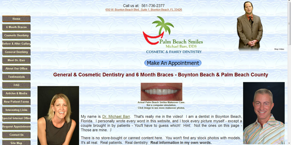
First, a screenshot of my regular website as it would appear on a regular computer display.
Next is how that same full-size website might look on a phone. It becomes quickly obvious that viewing a full-size website on a mobile device can be cumbersome if not simply a pain in the ass. It’s all scrunched up. You would need to zoom in and scroll all over the place to view it. The bottom line: visitors probably won’t stay for long trying to zoom in and scroll around. Not good!
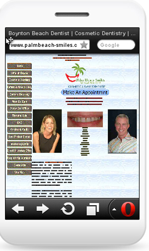
My full-size website as it would appear on a phone.
Now, here’s my new mobile site as it would appear on a phone. Bear in mind that this site is hot off the presses, and I have already started tweaking and re-writing the copy. I’ll be adding more images, as well. On the left is what a mobile visitor will see upon landing on my mobile site. On the right is the same page as the visitor scrolls down to the menu / navigation buttons. Very clean and easy!
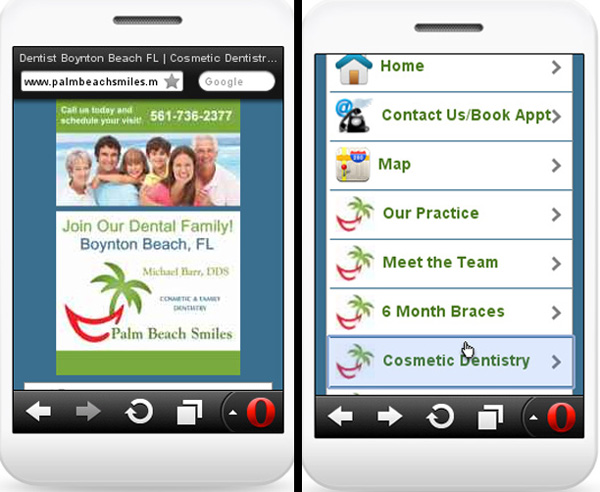
My new mobile site. The image on the left is the home page. As the visitor scrolls down, he or she will see the navigation menu. Click anywhere on the image to visit my mobile website.
Let’s click deeper and land on the Veneers page:

yourdomain.mobi vs. m.yourdomain.com
There are a couple ways to set up a mobile-friendly site. And, it is the subject of some debate. I’ll keep this as brief and non-technical as possible.
The first is to set up a separate website with its own .mobi address. It’s a completely separate and new website. The advantages are that search engines may automatically see them as “mobile-friendly” and give them preference to mobile searchers. Of course, this will cost a bit more, as you’ll need to register the .mobi domain and pay for hosting to create an entirely new site. Another possible advantage is brand congruency by using the .mobi variation of your full-size website: www.TheSameWebsiteName.mobi.
The second way is to create an “m” subdomain of your full size site. In this case the typical address for the mobile-friendly version of your site would be www.m.YourFullSizeSite.com. The advantage is that it will cost less. And, you (or your webmaster) will be able to access and control both versions “under one roof.”
Wait… there’s a third way… your mobile site can be set up in a sub-folder in your full-sized website directory. An example would be www.YourFullSizeSite.com/mobile. The same advantages apply as the m subdomain.
There are advocates and arguments for each way. I decided to go with a separate .mobi site after mulling it over. Your mileage may vary. Talk with your webmaster and decide which is best for you.
The art of redirection.
 Another important thing to do once you have a mobile site is to insert code into your full-size site that detects mobile users and redirects them to your mobile site. So, when a smart phone user either enters the address to your full-size site, or clicks on a link that leads to it, he or she will be taken (redirected) to your mobile site for a better experience. Make sense? This is something your webmaster will do for you, unless you’re a crazy do-it-yourself-er like me.
Is this some sort of digital Rorschach inkblot test?
You may have seen these funny looking boxes in print advertising. They even appear on posters, signs, and the sides of buses. They’re called, “QR codes.” QR is short for “quick response.” Many smart phones have apps that can scan these codes. When scanned, the mobile user may immediately see text, a video, or connect to a website. Very cool! If you already have a QR scanner app in your phone, you can even scan the code below and watch what happens!

Scan this with your smart phone right off your computer screen! Try it!
The potential for QR codes in all of your marketing efforts is nearly limitless. Off the top of my head:
- Any and all print ads you may be running.
- Office brochures.
- New patient welcome letters.
- Statements (if you do any billing).
- Business cards.
-
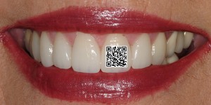
“Great smile, Mary!” “Thanks, to meet my dentist, just scan my tooth!”
On the front door to your office.
- On the back of your SUV or car.
- On t-shirts… worn by all your staff at a health fair.
- Tattooed on your forehead. Well maybe not. Or… MAYBE? You can get QR code temporary tattoos! Hmmm…
- Or maybe I’ll start adding QR codes on my veneer cases!
Remember, it doesn’t have to take users to your website. It could be a Youtube video, too! Lots of ideas and potential!
Go mobile early and often.
I am admittedly new to the mobile website arena. But, at this point, I’d say VERY few dentists have dedicated mobile websites. I’d recommend getting on this train as soon as possible! Google gives longevity of regular websites some serious weight when it comes to SEO (search engine optimization). I suspect the same will be true for dedicated mobile websites when it comes to mobile searches. Don’t dilly-dally around and suffer from paralysis by analysis (said the pot). Get on this!
I want to thank the folks at New Patients, Inc. for lighting the fire under me about this and helping me make it happen. They are dental marketing brainiacs who don’t recommend anything without a crap-load of research and data to support it. For more info, click on mobile websites by New Patients Inc.
Stand by for future Dental Warrior reports on how this is working!
 Copyright protected by Digiprove © 2013 The Dental Warrior®
What screen resolution did you build your mobile site for?
“Another important thing to do once you have a mobile site is to insert code into your full-size site that detects mobile users and redirects them to your mobile site. So, when a smart phone user either enters the address to your full-size site, or clicks on a link that leads to it, he or she will be taken (redirected) to your mobile site for a better experience. Make sense?”
So Mike, when is I purchase http://www.Michael‘sOwnWebsite.mobi , on on that page I have a button to “view full site”. Would my http://www.Michael‘sOwnWebsite.com just redirect them to the .mobi version.
It is annoying when I am surfing with my ipad and a website gives me the mobile version. I want the full version, I am on a ipad not a little phone.
Good points, and you’re right. If the link to the full site is the home page, and you have the redirect script activated there, it just goes back to the mobi site. And, that was an issue with mine. The solution: Have the link to the full site go to a page other than the home page… like your “about our office” page, for example.
I also agree with the iPad being redirected to the mobi site. That seems to be a default in most redirect scripts, including mine. I modified the script to not include ipads. My full site renders quite well on an ipad, and I’d rather ipad users land on my full site. One exception would be if your full site has a lot of “flash” in it, ipads will NOT render it well.
Thanks for chiming in. Good stuff!
Another question Mike.
Do you think Google will ding you for having duplicate content on the regular and mobile website?
This appears on both of your sites:
“You may need a crown for the following reasons:
Your tooth has a large cavity.
Your tooth is broken or has a large chip or fracture.
Your tooth has had root canal therapy.
Your tooth has a large, weak filling.
To replace a failing or unacceptable existing crown.
For cosmetic improvement. ”
Reading your book I know “content is king” and you warn about cutting and pasting.
Yes… I’ve got some duplicate content. When the mobi site was handed over to me, it was 100% duplicate. I did a bunch of re-writing over the weekend. It’s sometimes difficult to write up multiple unique descriptions of our services without SOME duplication. Heck I can hardly get dentists to write ONE unique set of copy. 🙂
Ultimately, nobody really knows (outside of those who work for Google) exactly how Google works. I know they ding duplicate content. But, I believe it’s a matter of degree. I think it’s when entire pages (or entire websites) are copied that Google takes notice. I don’t know that a short passage within 30-some-odd pages will ding an entire website.
So, I stand by my recommendations to create unique content. 🙂
I’ve been asking my web lady about mobile. She gave me this. It is all computer talk I don’t understand but might be helpful to others.
There is a 4th way of creating a mobile site if you don’t want to change content between that and the full-size site, which would be to have a separate set of CSS rules for mobile devices. The way I’ve done that in the past is to change it for screen sizes under 400px – that way it’s still full-size for iPads, but the mobile version for all small devices.
Another thought, if you wanted to use the same exact content, would be to park the .mobi domain on top of the .com or .net site.
if I parked http://www.mywebsite.mobi ontop of http://www.mywebsite.com, do you think I would get dinged by google for having duplicate content?
I guess I’m not sure what you mean by “parked.” To me, a “parked” domain is one that isn’t being used at all. You can “point” or “forward” a domain to another website, however. There are reasons to do that. A mobi domain is not one of them. All that does is display your regular website if someone happens to type in the mobi domain. A forwarded domain has no content, so it’s not “duplicate” content.
I see no advantage of simply forwarding a mobi domain to your full-size website.
Pingback: Google Reviews – I’ve Changed My Mind | The Dental Warrior
How is the mobile version doing? My kids are taking a nap and I am starting to write the content for my mobile site. “Content is King” but man is it a bit@h.
Yeah, writing content is a lot of work. It helps to have a creative mind! 😀
How is the mobi site doing? Hard to come to any hard conclusions, yet. I just looked, and in the last 30 days, I’ve had 50 visitors. I know last week we did get a call for a new patient appointment that specifically mentioned our mobi site. So, that’s good! 🙂
Honestly, I haven’t spent much time on it lately. I’m glad I’ve got it, though. I suspect it will become a bigger piece of the puzzle as time goes on.
Yeah, that is why I am trying to get a .mobi early. I read all your blogs and your super good book avaialble at http://www.revupmymarketing.com/
I know you were an early website owner in 1999. Smartphones are just increasing like crazy. So I want to get my .mobi website established early.
Is there an “google trick” to search for .mobi websites ONLY to see if anyone in my area has a .mobi website. Someting like where you google “your city dentist” but just .mobi websites?
I have not been able to figure out how to do a .mobi-only Google search. Also keep in mind that some people don’t do a .mobi site, but rather they do a sub-domain on their primary site such as: m.MyWebsite.com. Or they do a subdirectory like: MyWebsite.com/mobile.
So, I’m not aware of any way to use a filter in Google to just get mobile sites in the search results. Would be nice, eh?
I just looked at my Google Anyalytical. I had 126 mobile vistors to my main website last month. Need to get my .mobi site up. The more easy I can make it for people to find me the better!!! Off to go ask a question in the newest Google Analytical Blog article.
Arghhh….still meaning to do my mobile site. I have most of the content written and “condensed” to be more mobile friendly.
Any updates on your mobile website and how it is working for you?
Pingback: Dressing Up Your QR Code | The Dental Warrior® – A Blog for Dentists
How has you .mobi site been working? I hope to have my standalone .mobi site up in a month.
Seems to work fine. Still a vast majority of my traffic is on regular computers, though.