 Just for fun, I was ego-surfing on the search engine, Bing.com. I am a die-hard Google fan. But, I wanted to check it out and see how my website performs on Bing. Admittedly, I have made absolutely no effort to optimize my sites on Bing…. Yet.
But, that’s not the point of this blog post. I searched for “dental implants” in my city. My site shows up well on the first page of search results. But, my curiosity extended into checking out OTHER dentists’ websites. One in particular caught my attention, so I clicked on the link.
A friend in need is a friend indeed.
As it turns out I know this dentist. He’s a very nice guy and well-regarded. My intent here is NOT to make fun or ridicule the website. Rather, I applaud his effort to create a micro-site or niche-site for one of his services. It’s a strategy I advocate and practice. To be clear, it is never my goal to insult or disparage anyone when I use their websites to illustrate a point. Nevertheless, I do my best to conceal the identity of those dentists.
Let’s take a look!
First the good news. My friend’s website showed up on the first page of results for this search.
Overall, it’s a nice looking website. It’s pleasing to the eye and not too busy. Navigation is simple, as there are only four pages.
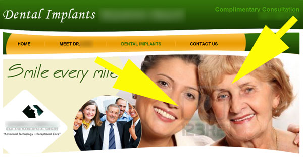
The first thing I noticed is the stock photo image in the home page header.

Yellow arrows point to watermark.
Copyrights online matter!
I know I’m a freak, but I couldn’t help noticing the watermark square in the middle of the photo of the two ladies. There’s some kind of logo and what appears to be “123RET” below the logo. This tells me the photo is copyrighted. And, judging by the logo and text in the watermark, I’m going to guess the copyright is NOT owned by the dentist. I use watermarking to identify my own copyrighted photos. And, I DO use some stock photos in The Dental Warrior blog. But, I pay for the licensing, so the owner’s watermark is removed.
First bit of advice here: Unauthorized use of copyrighted photos can get you in deep legal shit. Don’t do it! Some stock photo agencies are now AGGRESSIVELY pursuing unlicensed users of images.
Meet the dentist. Or not.
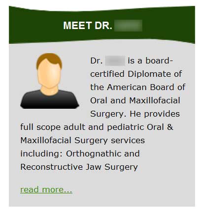
The next thing I couldn’t help noticing was this section of the home page:

Aaaaaaaagh!
Please, please, PLEASE put a nice, professional photo of yourself there, doctor! Hell… just get rid of the creepy faceless cartoon head! You’d be better off with no photo than the faceless cartoon. But, DO get a nice photo of yourself. You’re a good looking guy! (He is!)
Killing them softly with your words…
With a hat tip to Roberta Flack’s famous song… Finally, we get to the “real meat” of the website. That is the information about dental implants. Remember that many patients seeking care that involves significant expense (like implants, cosmetic and reconstructive treatment, etc.) are doing their homework. We must remember that they are NORMAL PEOPLE, not dentists. I’ve written many times that “content is king.” The key is to focus on BENEFITS, not features. Stay away from technical “dental-ese.”

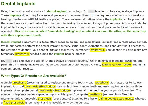
You’ll notice that I’ve highlighted some parts in yellow. First, I’ll say that this content isn’t that terrible. It starts off pretty decently, though it really lacks a good headline and lead sentence. It’s all pretty factual, and I can’t find any points of contention on a technical level. But, it’s simply too technical for the intended audience. It seems to be written BY a dentist (that’s OK) FOR dentists (not OK).
There’s really not ANY mention of BENEFITS.
There is a grammatical / spelling error in the third paragraph: “…. leading quicker recover…” I’m guessing it should read, “leading to a quicker recovery.” I think details like this (spelling and grammar) matter when I’m picking someone to perform surgery on me.
How many people (non-dentists) know or use the term, “prosthesis?” That word is peppered / stuffed throughout this webpage, especially the last paragraph. Dump that word! Few people know what it means. I bet they don’t know what a “fixed prosthesis” is, either. Is it something that’s been repaired? And, I dare say nobody is searching for a “prosthesis” on Google.
Do patients know what a “ball in socket attachment” is? Do they care? That’s NOT a benefit. It’s a FEATURE.
The entire last paragraph amounts to dental gibberish. It means NOTHING to a prospective patient. If they even got as far as the last paragraph, they were surely confused reading it.
A benefit could be described as, “Your new denture will have special attachments (like the snap on your pants) that will lock it onto your implants ROCK SOLID. You’ll be able to eat all your favorite foods. You’ll even be able to KISS WITH CONFIDENCE!”
I just made that up as I was writing. It’s really not difficult. Just quit thinking like a dentist! 🙂 Now I hope everyone doesn’t run off and copy that little gem verbatim. It’s mine! haha! Make up your own. How would YOU describe to a patient in your chair. THAT’S what you write on your website.
Which do you think sounds better to prospective patients??? “Ball in socket attachments?” Or “Kissing with confidence?”
That last paragraph on the webpage illustrates the old joke that if you ask a dentist for the time, he’ll tell you how to build a clock.
My friend has no idea that I was going to feature his website in my blog. I hope he doesn’t mind. And, I hope my critique will help. What if he starts making crap-loads of money because of my advice?? 😀
 Copyright protected by Digiprove © 2013 The Dental Warrior®
So Mike, will you shred,… Ahem, critique my site so I can make a crap load of money?
LOL! I might have to start charging a royalty! 😉