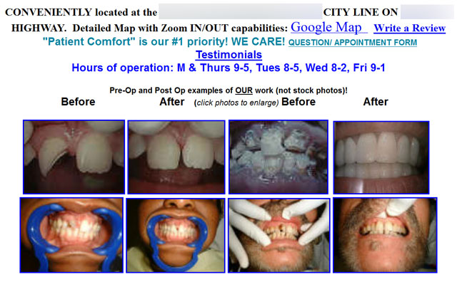
I just came across this dental website. I’ve written a fair bit about the value of photography on a website. Click on this link to see a list of articles on dental photography in this blog.
Just don’t do this!

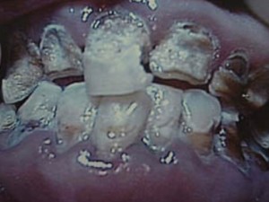
When I called my wife over to see this photo gallery, she looked and immediately turned away in revulsion and exclaimed, “GEEZ! I don’t want to see that!!” No normal person wants to see this. It’s a good thing I didn’t “click to enlarge” this photo from the gallery for my wife to see:

I also can’t help commenting on the copy (text) above the “gallery.” This is another example of what not to do…. multiple fonts, bold, colors, unrelated links…. just a cacophony of nearly useless copy. It doesn’t GUIDE the visitor through the website. It doesn’t make any point. It doesn’t provide any useful information. The visitor doesn’t know where to go or click first.
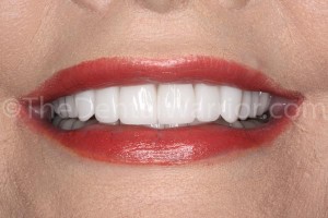
Back to photography… How about this, instead? This is a recently completed veneer case in my practice.


TMI! TMI!
I regularly advise dentists to think “smiles and faces.” Retractors, really yucky teeth, gloved fingers (or ungloved), blood, unrestored implant abutments, cotton rolls, prepped teeth, and anything else that will make a normal person turn away and shout out, “GEEZ!” don’t belong on a dental website. You don’t want visitors hitting the “back” button or closing the window in disgust. To use the current vernacular: TMI! (too much information – of the wrong kind).
 Copyright protected by Digiprove © 2013 The Dental Warrior®
But…but… It’s NOT stock photography!
LOL, Alan! Yes…. they’re proud of their work, and they should be! But, it needs to be showcased in an entirely different way.
Love the glamour shots!
Do you have someone who’s in charge of taking these photographs? They look like they were shot by a professional photographer!
The photographer is me. 🙂
Mike great advice. How do you get people to pose in such fun ways and allow you to use them on your public places? I always feel…well, embarrassed to ask! Maybe because I don’t know how or maybe it’s a conservative midwesterner Nebraska thing (even though I’m an outgoing guy)? Also how many patients per month would you say your web-site directly brings to your office if you wouldn’t mind sharing?
Ken
Hi Ken,
You’d be surprised that most patients LOVE posing for photos. They see the photos on the walls of the office, and they want to be there. Same thing for the website. There are a few that object, and we honor their decision. Those that agree, sign a release.
I’m often asked how many patients come through the website. It varies widely. But, I really don’t care so much about the quantity as I do the quality. I’d rather get a few (or even only one) really good patients than a lot of… well.. the other kind. 🙂 If my website brings in only one “big case” (or even “medium-size case”) patient this month, I consider it a success. A majority of my new patients come through the website.