Over the years, I’ve collected many dental print ads. It’s obvious to me that most of them were designed by dentists…. FOR dentists. I’ve posted other ads in the past… some pretty funny…. some pretty bad.
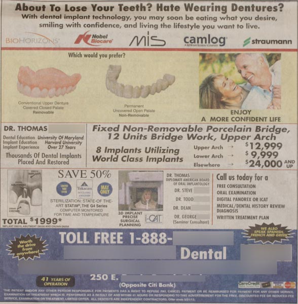
Today, I came across an ad in the local paper with a focus on dental implants.

Let’s pick it apart….
Headlines!
The headline is a very important part of any ad. This one says, “About to lose your teeth? Hate wearing dentures?” OK… not bad. It may get the attention of some people who wear dentures or are already expecting to lose their teeth. The sub-headline talks about the benefits of implants. That’s good. Unfortunately, the rest of the ad is about “features,” and that’s bad.
I’m not so sure consumers care about (nor recognize) the names of the dental manufacturers listed at the top.
Images!
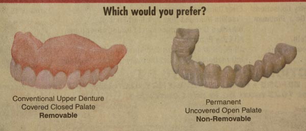
I’m going to zoom in on a few parts, so we can discuss them. Let’s start with the images:

Ugh! I’m not a fan of images of disembodied dentures or other dental prostheses in dental marketing pieces. It’s not that it bothers me, personally. I’m a dentist, after all. But, as a marketing guy who understands the CONSUMER side of the equation, I have to say this is a REALLY bad idea.
The question at the top is, “Which would you prefer?” Here’s what a consumer will say: “NEITHER!” First, they don’t even know what they’re looking at other than “false teeth.” And, to a non-dentist, there is no difference between the false teeth on the left vs. the false teeth on the right. Neither represent what patients WANT.
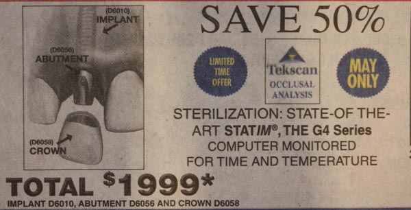
Here’s another image from the ad:

The diagram of how a single-tooth implant is constructed is NOT what appeals to consumers…. aka “normal people.” Once again, nobody WANTS that. Everyone likes sausage, but nobody wants to see how it’s made. Think BENEFITS rather than FEATURES. Consumers are interested in benefits. Period!
To the right of that image (can be seen in the top photo) is a photo of a woman in a CAT scan machine. Does this appeal to consumers? Is THAT what they’re buying? Another feature!
Technicalities
This section of the ad has other issues, as well. “Tekscan occlusal analysis,” is mentioned for example. Nobody other than dentists know what that is! Then it mentions, “State-of-the-art STATIM, the G4 Series computer monitored for time and temperature.” What does that mean? To a non-dentist… NOTHING. Besides not knowing what it all means, nobody cares!
How much would you pay now?
Now on to the section that first caught my eye… and made me laugh.

The top two lines are effectively gibberish to a consumer. But, even as a dentist, I’m not sure what it’s saying, as it doesn’t quite jive with what’s below it. You can be sure non-dentists have NO CLUE what this all means. “12 units bridge work?” And, then on the left side we are told that 8 implants will be used. World Class implants, no less! OK… 8 on top, and 8 on the bottom? Or 8 total, upper and lower? Who knows, and who cares?
And, now for the funny part. On the right side there is a list of fees:
Upper arch -> $12,999
Lower arch -> $9,999
ELSEWHERE -> $24,000 and up!
Elsewhere? The column on the left reads as the part of the body being treated, with the prices in the right column. Elsewhere? Where ELSE are you putting dental implants, doctor?? LOL!
Yes… I’m sure the idea was to state that other dental offices (elsewhere) charge more. And, apparently, he’s checked around and determined that they are all $24,000 and up. But, to several people who looked at the ad for me… they thought the $24,000 was for implants ELSEWHERE in the body.
Sell the sizzle, not the steak.
I’m back to talking about benefits (look good, feel good, last a long time) vs. features (Tekscan, Statim, disembodied dentures, and cut-away diagrams of implants in bone). Dentists are the kind of people who, when asked for the time, will tell you how to build a clock. The problem is that consumers just want their questions answered in PLAIN ENGLISH. And, mostly they want to know how it will look, how it will feel / function, and how long it will last.
As for images, I believe photos of smiles and faces (of actual patients) are very powerful.
Another way to communicate benefits is with patient testimonials. You can be sure they won’t be talking about osseointegration, Statim sterilizers, Tekscan occlusal analysis, or fixed non-removable units of bridge work!
OK! That’s it for now! Did I miss anything?
Chime in with your comments below!
 Copyright protected by Digiprove © 2013 The Dental Warrior®
Maybe the purpose of the ad was a “what not to do?”
Smile!
Warren
One could argue that’s the purpose of a majority of dental ads! 😉
I think print in general is losing it’s effectiveness. I’m shifting most of my (small!) budget toward online now and I’m seeing results!
You are DEAD ON!
Takeaways:
-sell solutions
-keep it simple
-make it easy for consumers to understand
Good point, Mary Beth. Think “problem –> solution.”
People are looking for SOLUTIONS (and benefits). They really, REALLY don’t care HOW you do it.
Will it: Look good? Feel good? Last a long time?
THAT’S IT!
I think this AD not so bad as described above. Maybe for the proffesional dentist not of such an “approved” one, but I believe that som patients will say : ‘Oh, it’s so simple 8 implants , 12 units bridge work and thats all, I have “new teeth”. As for the details the ‘doctor will explain them later…
My god… I’d be surprised if that ad helped sell anything….
This is the classic situation where the client paid to have an ad printed, but not designed; so the newspaper just got a poor intern to do it based on a brief from the client (copy & paste!)
As you said, happy smiles and old folks looking into the horizon is what works, not a close-up of a teeth drilled into my skull, no sir.
Woah, I wonder if the ad worked for them? Thanks for dissecting it, very helpful.
You are so right. Ads for dentists and ads for dental patients need to be totally different and to use the appropriate language for the target audience.